
portfolio
Data Visualizations with Tableau
Data sets I visualized in Tableau between 2010 and 2014. Each dashboard is interactive and publicly available.
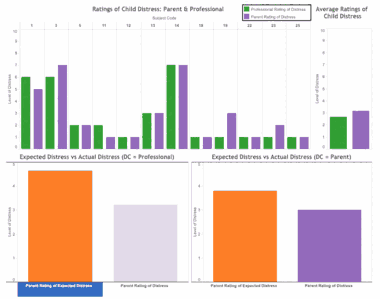
Distraction in Action: Distress
Professionals and parents rate a child's distress differently. This set of visualizations summarizes how distress is impacted by a professional distraction coach, and how those ratings relate to expectations before the procedure. Built to develop data insights for the Distraction in Action team.
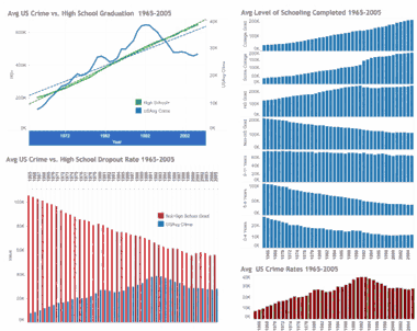
Crime, Education, & Income
Knowing how education and income relate to crime matters for any society. This set explores the relationship between average crime rates, education level, and income across Iowa and the United States. Built for the University of Iowa Data Visualization course.
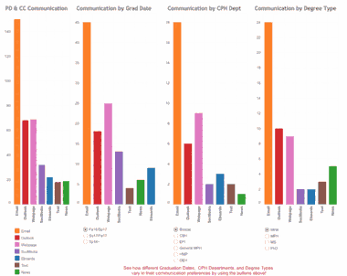
College of Public Health Career Preparation
Colleges aim to prepare students for the real world, but individual student needs vary. This set compares communication and preparation preferences across degree programs and the departments that provide them. Built for a project with the University of Iowa College of Public Health.
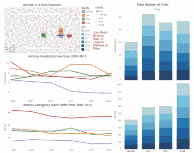
Asthma in Iowa
Health researchers use this data to identify hot spots of asthma-related illness and events. This set shows how hospital admission rates change over time across four Iowa counties.
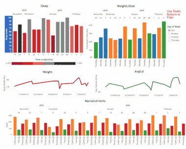
A Better Ben: Health Insights
Personal health insights can drive behavior change and reinforce healthy habits. A glimpse into my own health data on sleep, weight, caloric intake, and macronutrients.
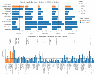
Malnutrition in the World
Malnutrition affects lifelong health and development around the world. These visualizations identify where malnutrition and obesity pose greater risk compared to other countries and regions.